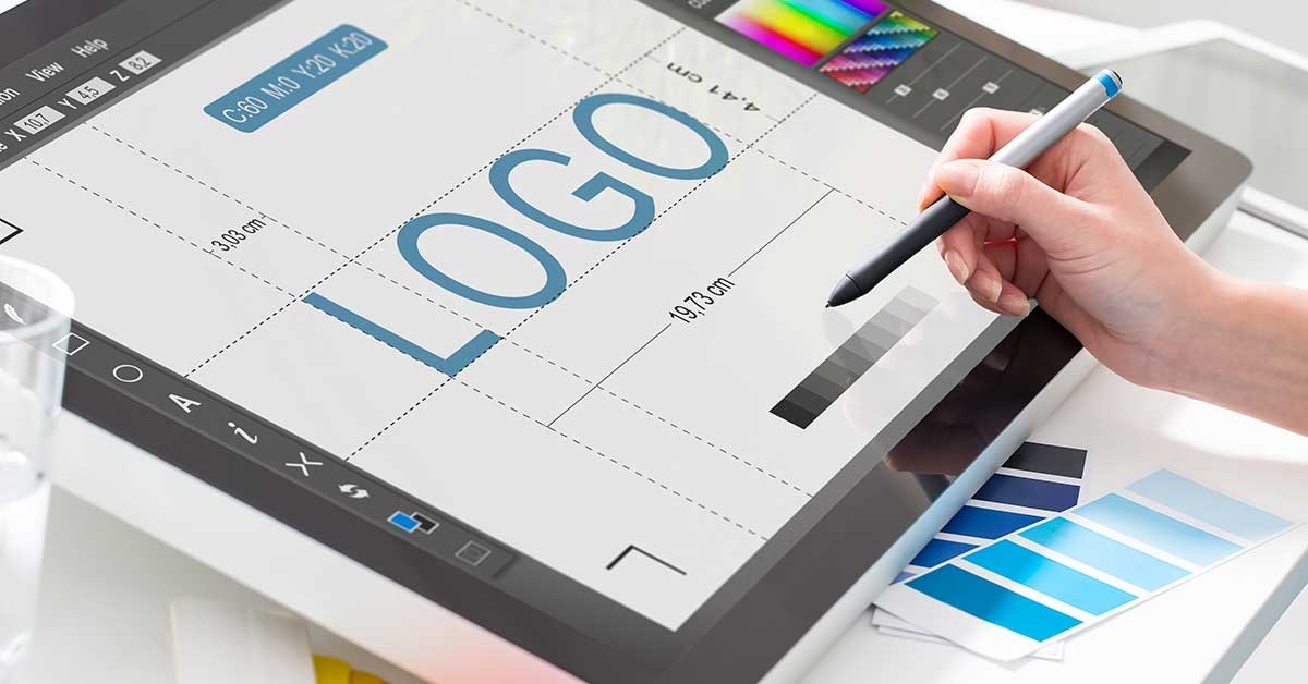
What is more important than your brand’s name? It’s the logo. Most people are visual creatures, so when they hear your brand name, they’re going to think about the image affixed to it. The logo is a pivotal piece of your brand identity. That said, a logo has to portray your brand in such a way that it convinces people to make a purchase from you.
Times are changing. It’s time to consider that you might need to alter the face of your brand, as well. Take a look at the current brand logo and ask yourself if you to revise your brand image.
To help you out, here are some signs you need a new logo:
-
Your Logo Looks Bad on Different Media Forms
If your logo looks awesome digitally but gets pixelated or incomprehensible on paper, you have a problem. A decent logo is one that can be printed and enlarged or shrunk and still be recognizable. Test the logo to make sure it looks good in black and white or in color and with effects. Although the base design should not change, it should look acceptable (and familiar) across all forms of media.
If it doesn’t, you need a new logo.
-
Your Logo is More Than 10 Years Old
Ten years ago might not seem like a long time when you consider how long more popular logos have been around, but the truth is that even the most prolific logos out there have been revised throughout the years. Take a look at the chronology of the Apple icon or at the Pepsi logo and you will see small differences. Twitter has made interesting changes, too.
These little tweaks will keep your logo looking fresh and up-to-date. You don’t need to do a total reconstruction. Just give your logo a makeover—and it will do your business a world of good.
-
Your Logo Was a Low-Budget Project
There is a noticeable difference between a DIY logo and one made by a professional. The DIY version will always look cheap—and that’s not good for your brand image. If you want to emphasize quality and professionalism, then you need a logo created by someone with the correct tools and experience. Otherwise, the logo will not compliment your efforts.
-
Your Logo Is Complex
Another sign of a mediocre logo is one that is too complex. You don’t need crazy fonts, gradients, and a million shapes to stand out. Realistically, the best logos are the ones that can be easily recalled, like a mermaid or a swish. Even without saying the brands, you already know what I’m talking about!
Complex logos look outdated and clunky. If you want to stick with the trends, streamline the design.
-
Your Logo No Long Matches Your Business Culture
The business you are running now is not the business it was two, five, or even ten years ago. An old logo was made to represent something that no longer exists. Therefore, you need a new logo to reflect new company values and objectives. Again, it doesn’t have to be entirely different, but it should include elements of your brand as it is currently.
To summarize, you need a new logo if the design is older than a decade, no longer reflects your business culture, is clunky, or uses outdated design trends. Your brand image is important, so you should be updating it accordingly to match what your business hopes to become.


